Project Brief
What is Vela?
Vela is a mobile first responsive web app designed to make reading wind and weather forecasting information easy and convenient to understand.
Objective
Provide beautifully displayed and easy to understand wind, wave and weather reports, forecasts and statistics for sailors, surfers, divers and any other water sport aficionado.
Context
Days on the water are meant to be everything but stressful. To avoid complications, it’s good practice to check the conditions of the wind, waves, and weather near the body of water where we will be having fun. This can help us avoid dangerous situations and better prepare for a day of sailing, diving, or surfing. Existing weather apps aren’t meeting the goal of displaying complex weather data in an accessible, easy-to-comprehend way to people who regularly engage in water sports.
Possible Problems
Safety: Is it safe to go surfing today given current weather conditions?
Enjoyment: Is there going to be enough wind to go sailing today? Is it worth the trip?
Easy to Use: Charts and graphs of wind patters are confusing, how can it be simpler?
Unexpected Adventure: Are there places nearby to me that would be fun to explore?

Competitive Analysis
Overview
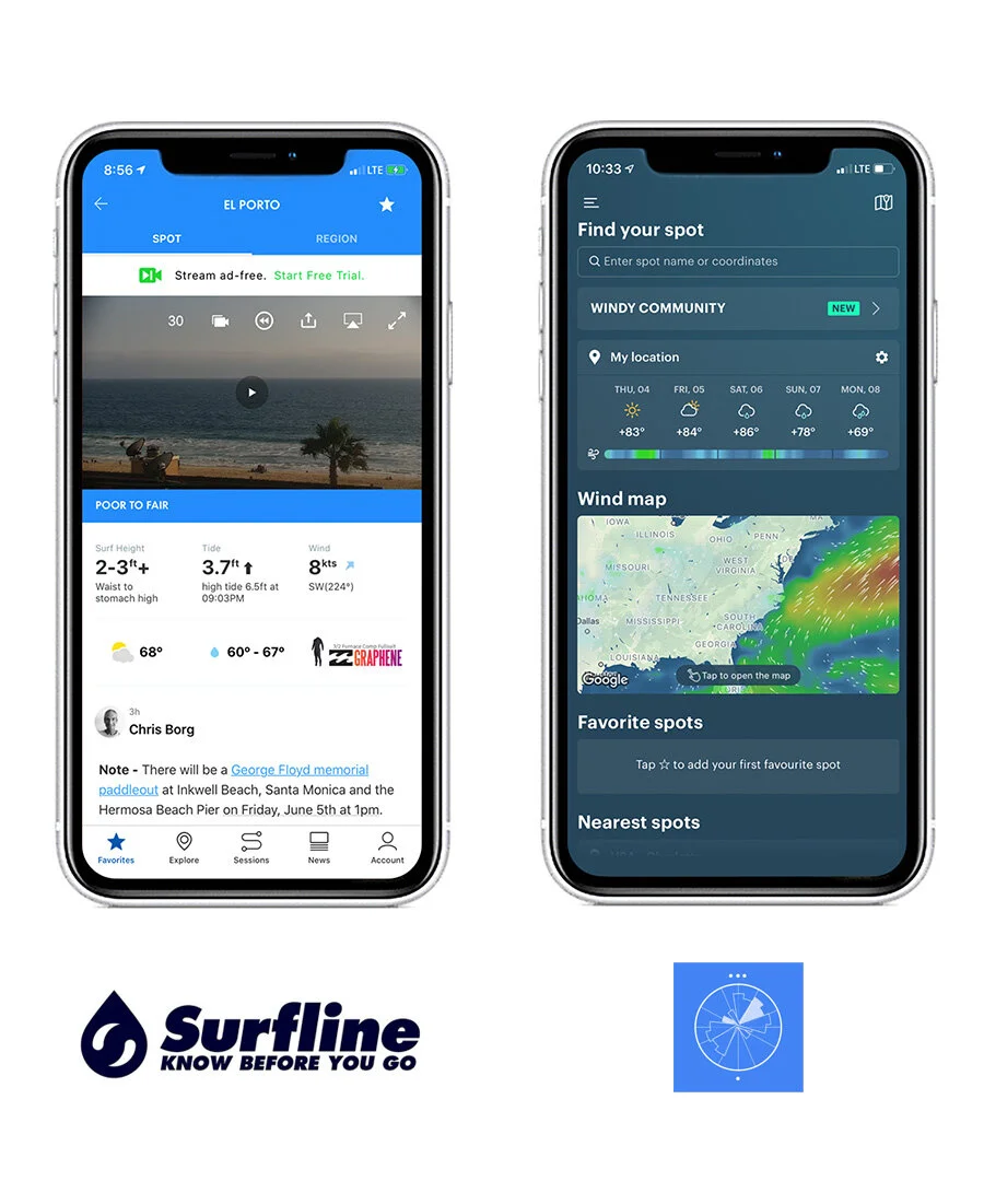
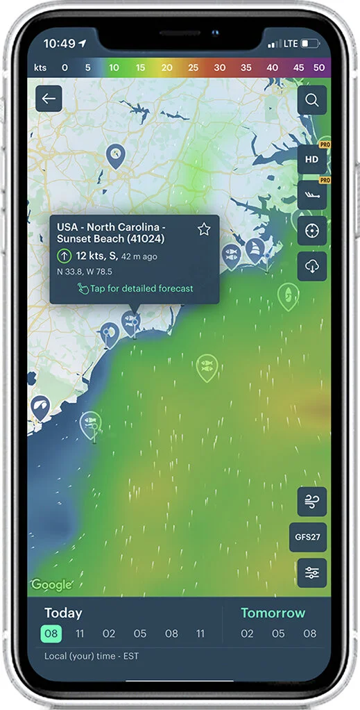
Two popular applications offering wind & weather forecasting for water sports were evaluated to look for opportunities to improve features and examine a niche for Vela. Surfline is a popular app used by surfers with web camera access to evaluate conditions and Windy offers weather and wind forecasting with a great amount of detail. From user interviews a lot of this data was seen as complicated especially for new surfers, sailors and divers. This offered and opportunity for Vela to create an experience that was focused and not burdened by scope creep.
Surfline
Live HD Surf Cams in real time on Surfline's network of 500+
Offers Swell Forecasts and Surf Reports
Explore allows users to find surf locations closest to them
Ability to track surf sessions for Apple Watch owners
Includes lifestyle content in the form of News
Expert Analysis - Employs a surf report forecast team that actively manages weather warnings and surf reports.
Surfline’s Location Display
Complicated wind data in Surfline’s dashboard
Strengths
HD Camera coverage
Community content such as blog posts and podcasts
World Surf League Forecasting Sponsor
Has a large market share of surfers
Offers Session tracking for Apple Watch users
Has a location API that allows users to find surf spots closest to them
Weaknesses
Pushes users to pay for premium membership at $9.99 a month
Heavily reliant on ads to pay for free services
Ads have long loading times and affect other services
Not actively marketing themselves digitally
It doesn’t have a specific focus as a service or product.
Opportunities
An interface that is simpler and easier to use
Safety doesn’t seem to be a consideration
Creating an ad free version that doesn’t require a membership fee
Does not include algae reports in the app
Focuses primarily only on the surfing market, a generalized water sports app would have a larger market
Threats
Camera coverage costs - it looks like they might not be able to afford the infrastructure costs due to how many ads are in the app and website.
Seems reliant on pushing users to go to the paid membership model for future profitability.
Doesn’t seem that tech savvy and management top-heavy for an app
Windy
Live wind coverage with direction and speed infographic in their wind map.
Features weather forecasting for the user location.
Community hub for users to post photos and discuss topics.
User able to favorite specific locations.
Includes a Nearest Spots location for users to explore.
Windy’s home screen
Windy’s map and location screen
Strengths
It’s product is already in use and well known
It keeps the usability needs simple with details available when necessary or needed by the user.
Offers value for free without user login or membership
Accurate information for water sports
Weaknesses
Weak branding
No active marketing efforts
Does not feature Webcam network where some other weather apps do.
Relies heavily on app store ad as main marketing channel.
URL is uncommon windyapp.co
small development team
Opportunities
Better branding and marketing for the app
Does not include algae reports
The product doesn’t have custom tailored content for specific sports other than report information.
UI in detailed views could be simplified, the standard charts with temperature, wind direction and wind speed which is still in a saturated view.
Threats

Download the complete competitive analysis to see breakdowns on usability issues and additional details.

Problem Statement
“Surfers, sailors and divers need a convenient way to check for ideal conditions and bad weather forecasts. I will know this to be true when I see daily use of the app.”

Personas

Personas for surfing and sailing were created from conducting user interviews and research. Diving was found to be less concerned with wind data in comparison to the other sports so the app was focused on serving the surfing and sailing community. Task analysis and user flows were developed to address specific concerns of each persona. Another insight from interviews and research was weather and wind direction from forecasting is very difficult to predict ahead of time so it is likely forecasts will change often. As a result, the idea of including a notification setting for “ideal conditions” allowed for users to know when it would be best to go surfing, sailing or diving without having to constantly check for updated forecasts and changing conditions.

Download the Task Analysis and User Flows for the insights developed from the personas.

Wireframing

Initial sketches for Map, Weather Display and Menu UI

Alternate concepts for the weather & wind display using illustration
Wireframing
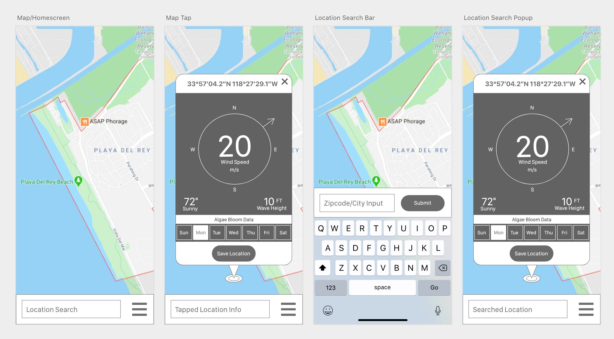
Sketching wireframes and designing mid-fidelity prototypes enabled me to begin usability testing. Initially the designs were a bit more complex and detailed but strayed away from focus of making the complex data simple and easy to understand. The UI was simplified to focus on wind speed and directional with secondary information of weather, wave height and algae bloom information.

Usability Testing
Test Goal
The goal will be ensure ease of use and intuitive organization of features in order to complete the tasks using the Vela app.
Test Objectives
Demonstrate the ease of use of the UI when searching for locations to determine weather conditions.
After completing onboarding, does the UI make sense to the user in how they will interact with the app?
What is more useful, tapping the map or using the search bar?
Evaluate the UI for the wind & weather information display to ensure comprehension.
Does the user understand what direction the wind is blowing from the UI?
Can the user select what day of the week they want to check?
Does the algae bloom data need to be demonstrated differently?
Determine product’s core features for surfers and sailors as necessary and valuable.
Is there missing information that a surfer or sailor would need that isn’t being addressed by the design?
Are there features that should be added to add more value to the app?
Mid-fidelity wireframes used for testing purposes
Test Results
After conducting the testing sessions for the Vela prototype there were minimal issues since the overall functionality was focused and streamlined. There were some features missing from the app or not fully thought out and considered in how they would be implemented but they should be fairly easy to extend. Most of the observations and quotes from each user reaction was positive and found the features easy to use and understand. Overall there will be minimal changes to the prototype based on the findings of this testing.
Issue 1 (High severity): User data disclosure should be included in the user settings section to explain how user data will be used. This is necessary in compliance for privacy laws based on user data and required for any registered user.
Suggested Change: Include a section including the data disclosure for the app.
Evidence: One of the participants is a Director of Product Marketing and highlighted this as something that should be included.
Issue 2 (Low severity): Onboarding included some issues with the coach marks including too many arrows pointing to features so users had some trouble understanding what the expected action should be. This was in relation to the onboarding screen related to the wind & weather information showing an arrow to “Save Location” and selecting the menu to continue.
Suggested Change: Instead of including both actions in the same screen, making a default location action a guided tutorial to set a home location might be a better idea to familiarize the user with the feature.
Evidence: Every participant attempted to click on the “Save Location” button in the onboarding first before clicking on the menu despite having instructions saying, “Select Menu to continue.” People took the first action they thought they were expected to take first and didn’t read all the relevant text on the screen.
Issue 3 (Low severity): Social features aren’t thoroughly considered in how they will be implemented, either as a social integration or an included friend list feature added to the app.
Suggested Change: Updating “activity status” should bring up an option to share to social platforms such as Twitter and Facebook through an integration. This should also be called out in the onboarding.
Evidence: Activity Status in the Menu of the app doesn’t link anywhere and it’s unclear what this will actually accomplish.
Issue 4 (Low Severity): Notifications settings are primarily set up to be push notifications but they aren’t in some kind of a message center in the UI of the app for later review.
Suggested Change: Include a notification history or message log so users can reference it later or see the notification if they are already in the app.
Evidence: One of the participants didn’t understand why it wouldn’t be included in the app itself.

Polishing The Design


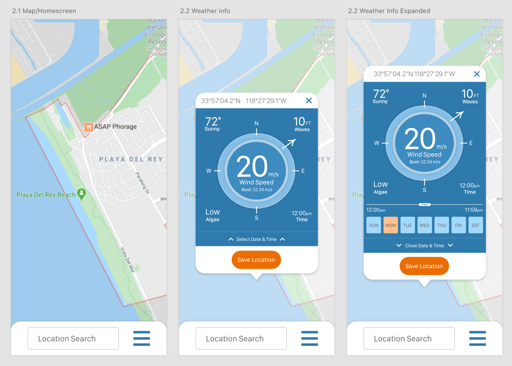
Final designs and mock-ups were created from the usability testing. The primary feature of the app is the wind & weather display UI. It combines wind speed, wind direction, weather info, wave height, algae bloom content and time for a specified date and time. Users are also given the option to save the location on the map for easy later reference.

Download the PDF for more details on how the UI has evolved through testing and development.

Final Design
By collaborating with other UI/UX designers, the final app design was fully realized and a unified style for Vela was established as a design language for the Vela brand.


Download the PDF to view the complete design language developed for Vela
Video Tour


