Project Brief
What is Okaeri?
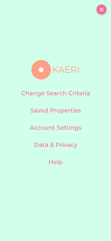
Okaeri is a mobile first responsive web app to make real estate browsing an easy and relaxing experience. “Okaeri” means “welcome home” in Japanese and is used as a greeting when a person has returned home and it was chosen as a fitting name for the app.
Objective
A responsive web app that provides property buyers with information on properties of interest.
Context
Real estate investment is an increasingly popular way for individuals to achieve financial security. It is an exciting and emotional experience, but complicated. While there are plenty of blogs and agencies providing information, often, buyers new to the market may struggle to get started without professional guidance and waste time viewing properties out of their range. This web app will provide them with the expertise needed to get started efficiently.

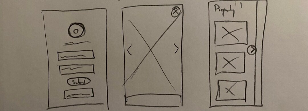
Wireframing
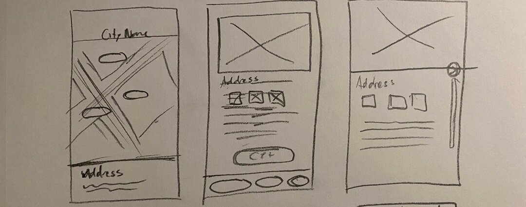
Low-Fidelity wireframes sketching initial concepts for the map page, listing details and other misc screens to get a sense of what is needed by the app.

Mid-Fidelity Wireframes
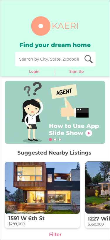
After completing the initial sketches, wireframes were created to begin assembling the necessary features and functions for the app UI. How users searched for real estate listings, specified search criteria and viewing the details of each listing were considered while working on the initial concepts.

High-fidelity wireframes were later developed by doing research on the design patterns of other real estate apps but with a focus on simplification of the UI to be less cluttered and removing unnecessary details to reduce distraction and overwhelming the user.

Moodboards

Mood boards were created to guide the design principles of Okaeri. Inspiration was taken from the above examples for their ease of seamless browsing.

The cute illustrative style and rounded corners of the UI of the above apps were used to derive a personality for the app of being fun and enjoyable.

San-serif typefaces would make the UI modern and easy to read. Montserrat was ultimately chosen because the curves in the type gave it a unique visual style in contrasting font weights. The color palettes were selected to be vibrant and fun, though some of them would not work due to low contrast in the UI affecting visibility.

Comparisons were done to other real estate web app UIs in order to find design patterns that worked well and areas that could be improved.

Comparisons were done to other real estate web app UIs in order to find design patterns that worked well and areas that could be improved.

Comparisons were done to other real estate web app UIs in order to find design patterns that worked well and areas that could be improved.

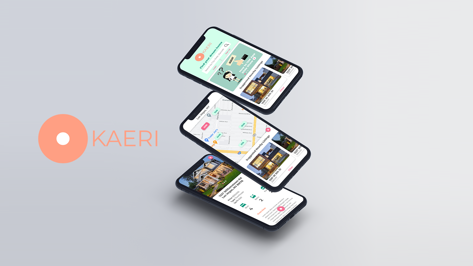
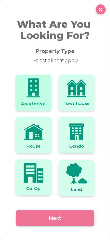
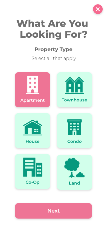
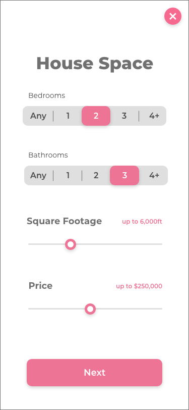
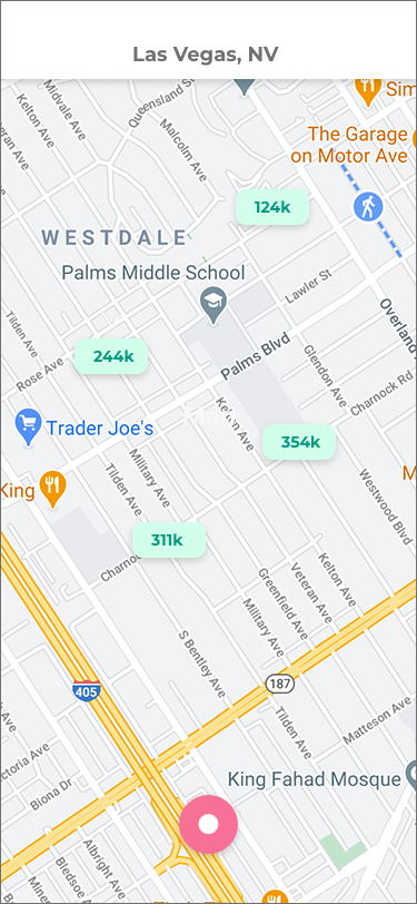
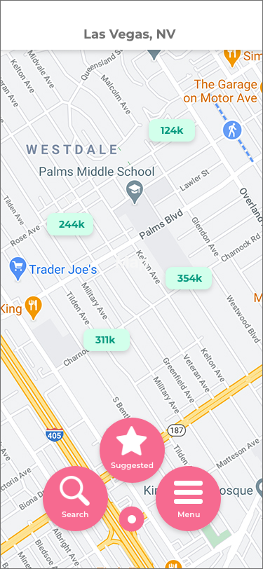
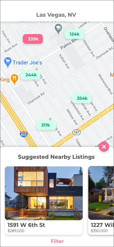
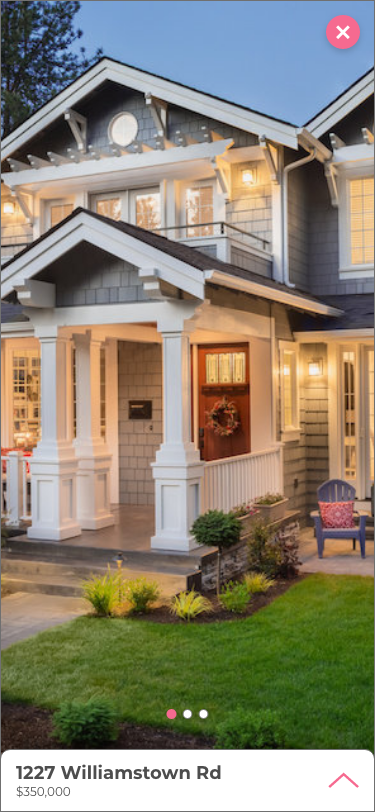
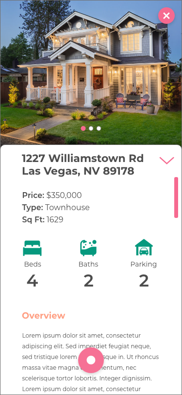
Mobile Mockups
The visual style inspiration and design principles from the mood boards were used to guide the final UI mobile mockup designs.

Animation
The simple navigation menu animation was designed to be quick and effective.

Style Guide


Responsive Design
Different breakpoints were developed based Desktop and Tablet resolutions and aspect ratios to take advantage of how best to adapt the mobile-first UI concepts in other devices that a user might use to view the web app.

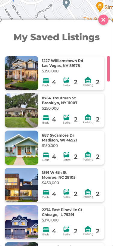
Home Screen

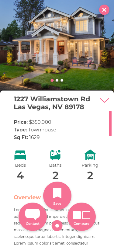
Listing Details

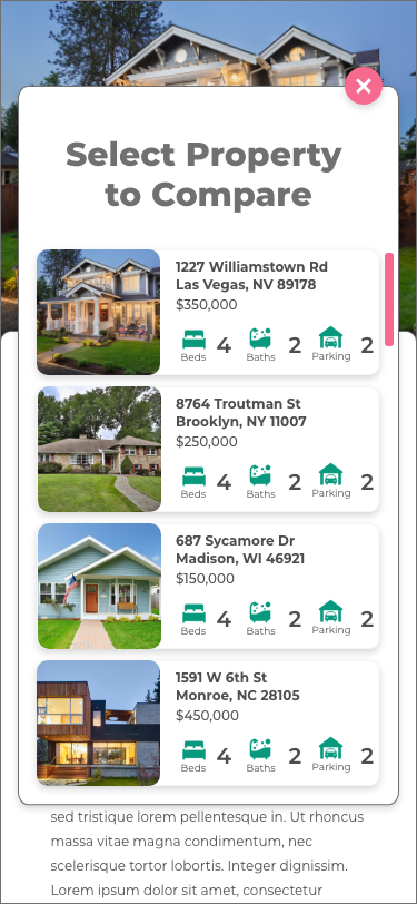
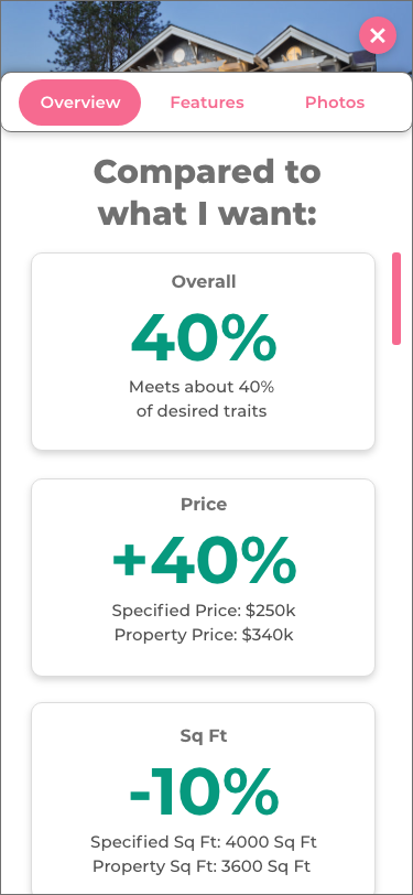
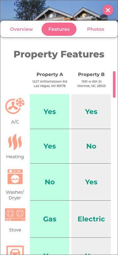
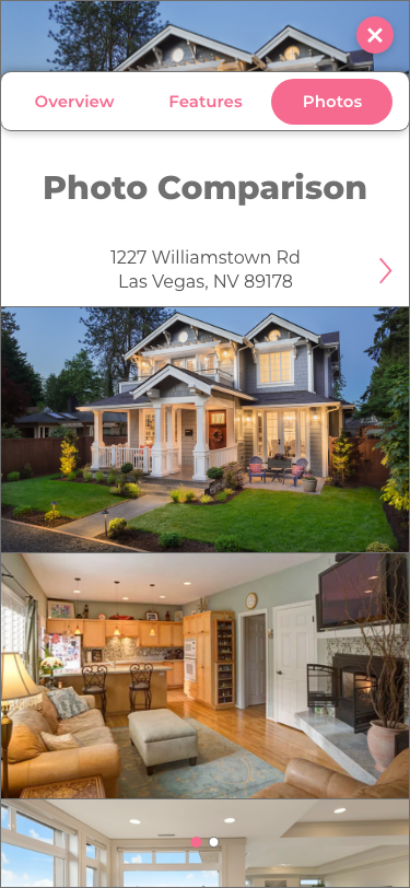
Property Comparison
Final Prototype
The completed designs were implemented in a fully interactive prototype for developer and client reference.